Resolution and Pixel Density
Typical mobile devices like smartphones and tablets come in all kinds of resolutions and pixel densities. qx.Mobile applications are able to adapt to all those different environments as described in the following sections.
Fortunately, you don't have to care much, as the framework handles most of it automatically. But it also enables you to further optimize for a great user experience on such devices as explained below.
High Pixel Density
Many modern devices ship with high pixel density displays. The measurement of pixel density is in units of ppi ("pixels per inch"), sometimes called dpi ("dots per inch"). Starting at about 300ppi a display's individual pixels become indistinguishable to the human eye at regular viewing distance. Therefore such devices are commonly said to have "Retina" displays.
In order to let applications continue with their pixel values used internally (e.g. CSS sizes like width: 100px;) high-density devices introduced another parameter: a ratio that maps CSS pixels to hardware pixels. This ratio is called the "device pixel ratio". The device takes care of scaling the CSS pixels (also called "device-independent pixels (dips)") to the physical pixels of the device.
The following device pixel ratios are common on mobile devices:
- iOS
- 1
- 2 ("Retina")
- Android
- 1 (mdpi)
- 1.5 (hdpi)
- 2 (xhdpi)
- 3 (xxhdpi)
The device pixel ratio is chosen by the manufacturer to properly match the pixel-density to the device's physical resolution and dimensions. But surprisingly and despite its name, it is not just a device-specific, fixed value. For instance, modern desktop browsers also change the value of device pixel ratio at runtime when you change the browser's font size. qx.Mobile handles that for you transparently.
In summary, a qx.Mobile app takes high-density displays into account for layout sizes, font sizes, and high-resolution images.
Resolution-independent Theming
Since qx.Mobile 3.5 all themes that ship with the SDK are resolution-independent. They no longer use pixel values internally, but derive all their individual sizes (such as paddings or border widths) from the global application font size. Technically this is achieved by using the relative unit rem throughout the theme.
Thus, at startup (or at reload) your app will layout with respect to the font size setting of your browser. Also at runtime, whenever you decrease or increase the application's font size, the theme (and therefore the entire visual part of your app) will adjust itself accordingly.
Font Scale
You can easily change the font size of your qx.Mobile app programmatically. For instance, this allowed you to offer the users a settings dialog to adjust the total scale of the app to their liking.
The change is relative to the global font size (e.g. predefined by your browser's settings). You set the new relative value, e.g. a factor of 2 for 200% scaling) through the method setFontScale on qx.ui.mobile.core.Root:
qx.core.Init.getApplication().getRoot().setFontScale(2);
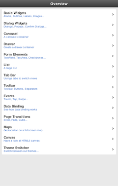
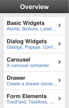
The first image shows a font scale of 0.5, the scale on the second is 1.5:
App Scale
The font scale isn't the only scale parameter. Usually one would be interested in the total app scale. This app scale expresses the effective scaling of your app. For instance, if the app scale is 1.75, an image with an original width of 100px, would appear on the display as 175 pixels wide.
var scale = qx.core.Init.getApplication().getRoot().getAppScale();
The app scale calculation takes into account both the font scale as well as the reported device pixel ratio. As mentioned above modern desktop browsers tend to modify the pixel ratio when changing built-in font sizes. So with both parameters the effective app scale can be determined quite reliably on many modern browsers.
High-Resolution Images
The total app scale is important when displaying images. Regular bitmap-based images would get blurry for high app scales. This can largely be overcome by supplying additional versions of the same image.
You only have to follow a simple naming convention for those additional resources. The framework picks the best match for each image from the supplied high-resolution versions. The code of your app doesn't have to be modified. This is possible because your app's images are handled as "managed resources" by the qx.Mobile toolchain. In whatever scale or on whatever high-pixel device your app runs, it will internally look-up the best possible fit based on the determined app scale.
Location and naming conventions
The high-resolution images are assumed to be located in the same folder as the default resolution image, but are annotated with the corresponding optimal scale:
<filename>@<appScale>.<fileextension>
As an example, assume the following medium resolution image is part of your project's resources: source/resource/<APP_NAME>/icon/image.png
The "resolution" of an image is given by the total amount of pixels available in each dimension. Lets say image.png is 200 x 100 pixels. In your image processing tool (e.g. Photoshop) take the original, high-quality sources that you created the regular image from. Now create a high-resolution version. Optimized for app scale 200% its resolution would become 400 x 200 pixels. Save that larger image as image@2x.png. Do so for any scales and images you like to support. That's it.
Remember that not just the device pixel ratio determines the effective app scale. If device pixel ratio returns 1.5 but your font scale is 2, then the best image resolution would be 3x. The application would try to display the resource image@3x.png.
Fallback
qx.Mobile by default checks for the most common image resolutions:
- @3x
- @2x
- @1.5x
In your app you can adjust the set of scale factors to check by modifying this static array:
qx.ui.mobile.basic.Image.PIXEL_RATIOS
For the best visual result qx.Mobile uses the following fallback logic:
- It searches for an image with an exact or higher resolution, which is nearest to the actual app scale.
- It searches for an image with a lower resolution, which is nearest to the actual app scale.
- If no high-resolution image is found, the medium resolution image is displayed.