Layouts
qx.Website contains support for CSS flexbox layouts, a layout system where items are dynamically resized to fit the available space.
See this guide on css-tricks.com for a detailed explanation of the spec.
qooxdoo's predefined flexbox CSS classes are compatible with all modern browsers (current versions of Firefox and Chrome, Internet Explorer 10+).
Examples
Horizontal Box with flex-align: end
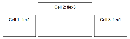
<body class="qx-flex-ready">
  <div class="qx-hbox qx-flex-align-end">
    <div class="qx-flex1">Cell 1: flex1</div>
    <div class="qx-flex3">Cell 2: flex3</div>
    <div class="qx-flex1">Cell 3: flex1</div>
  </div>
</body>
Vertical Box with flex-direction: row-reverse and flex-align: center
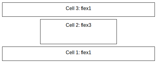
<body class="qx-flex-ready">
  <div class="qx-vbox qx-flex-reverse qx-flex-align-center">
    <div class="qx-flex1">Cell 1: flex1</div>
    <div class="qx-flex3">Cell 2: flex3</div>
    <div class="qx-flex1">Cell 3: flex1</div>
  </div>
</body>
Including the flexbox styles
The flex layout classes are defined in SASS files which are used to generate the CSS for qx.Mobile as well as qx.Website. To include them in your own project, simply create an include file (e.g. layout.scss):
@import "<qooxdoo_sdk_path>/framework/source/resource/qx/scss/_mixins.scss";
@import "<qooxdoo_sdk_path>/framework/source/resource/qx/scss/_layout.scss";
And use the SASS compiler to generate a CSS file:
sass layout.scss layout.css