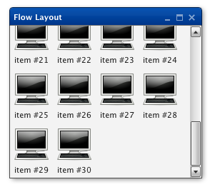
Flow
Note
This layout manager is available since qooxdoo 0.8.3.
A basic layout, which supports positioning of child widgets in a 'flowing' manner, starting at the container's top/left position, placing children left to right (like a HBox) until the there's no remaining room for the next child. When out of room on the current line of elements, a new line is started, cleared below the tallest child of the preceding line -- a bit like using 'float' in CSS, except that a new line wraps all the way back to the left.
Features
- Reversing children order
- Manual line breaks
- Horizontal alignment of lines
- Vertical alignment of individual widgets within a line
- Margins with horizontal margin collapsing
- Horizontal and vertical spacing
- Height for width calculations
- Auto-sizing
Description
The Flow layout imitates the way text is rendered. Each child is placed horizontally next to each other. If the remaining space is too small a new line is created and the child is placed at the start of the new line.
It is possible to specify a horizontal alignment for all children. This is equivalent to center, left or right alignment of text blocks. Further it is possible to specify the vertical alignment of each child in a line.
This layout supports height for width, which means that given a fixed width it can calculate the required height.
Layout properties
- lineBreak (Boolean): If set to true a forced line break will happen after this child widget.
