Toolbar
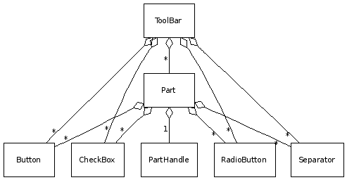
The ToolBar widget is responsible for displaying a toolbar in the application. Therefore it is a container for Buttons, RadioButtons, CheckBoxes and Separators.
Preview Image
Features
- Buttons
- Regular
- Radio
- Toggle
- Menu
- Icons and / or labels for all buttons
- Separation into parts
- Separator handles
Description
The qx.ui.toolbar package, which contains all stuff needed for the toolbar widget, has the main class called ToolBar. The ToolBar class is the main container for the rest of the classes. If you want to group your buttons in the toolbar, you can do this with parts. The parts class acts as a subelement of the toolbar with almost the same functionality. To a part you can add buttons. There are some kinds of buttons in the toolbar package:
- Buttons
- Radio buttons
- CheckBox buttons
- MenuButtons
- SplitButtons
These buttons can also be added directly to the toolbar if no parts are needed. For further structuring in the toolbar, a Separator is available in the package which can be added.
Diagram

Demos
Here are some links that demonstrate the usage of the widget:
