The virtual ComboBox acts like the regular ComboBox, but is based on the framework's virtual infrastructure.
Mouse and keyboard behavior:
| keyboard | open drop-down | key down; key up; | |
| close drop-down | esc; enter | ||
| mouse | open drop-down | click on arrow button | |
| close drop-down | click on item; click outside drop-down | ||
| drop-down closed | keyboard | select next | not possible |
| select previous | not possible | ||
| select first | not possible | ||
| select last | not possible | ||
| mouse | select next | not possible | |
| select previous | not possible | ||
| drop-down open | keyboard | select next | key down then enter |
| select previous | key up then enter | ||
| select first | page up then enter | ||
| select last | page down then enter | ||
| mouse | select next | click on item | |
| select previous | click on item | ||
| wrap in list | no | ||
| preselect | mouse over; key up; key down | ||
| select drop-down item on open | yes, first item in the list which begins with value |
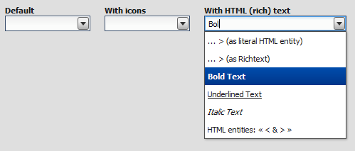
The qx.ui.form.VirtualComboBox is based on the virtual infrastructure. The virtual SelectBox has both a TextField and a Virtual List drop-down. The drop-down can be used to predefine values which the user can select.
Using the virtual infrastructure has considerable advantages when there is a huge amount of model items to render: Widgets are created only for visible items and reused. This saves both creation time and memory.
The virtual ComboBox uses the same qx.ui.list.core.IListDelegate interface as the Virtual List to configure the ComboBox's behavior (item and group renderer configuration, filtering, sorting, grouping, etc.).
Note
At the moment we only support widget based rendering for list and group items, but we are planning to also support HTML based rendering in a future release.
Here's an example. We create a simple ComboBox example with 2500 items, sorting the items (ascending) and log each value change.
//create the model data
var rawData = [];
for (var i = 0; i < 2500; i++) {
  rawData[i] = "Item No " + i;
}
var model = qx.data.marshal.Json.createModel(rawData);

//create the SelectBox
var comboBox = new qx.ui.form.VirtualComboBox(model);

//configure the ComboBox's behavior
var delegate = {
  sorter : function(a, b) {
    return a > b ? 1 : a < b ? -1 : 0;
  }
};
comboBox.setDelegate(delegate);

//log value changes
comboBox.addListener("changeValue", function(e) {
  this.debug("Value: " + e.getData());
}, this);